How much does branding matter, really? The #1 goal of any creator is to provide good content for their audience, right? To tell a good story. Yes, but readers, especially potential repeat readers, want to know what to expect from you. Branding helps with that.
Your brand should represent the emotional response you want from your readers.
The idea of branding used to freak me out. It’s kind of along the same lines as “author voice” that way. How does one even find that? Can it be manufactured? Won’t someone just tell me what the answer is??
But after hearing about “creating your brand” for years at different conferences, I’m finally embracing the idea of fine-tuning my brand. I’d like to break that down for you here, and maybe it’ll help you find yours too, if you’re looking.
Color has meaning.
Find one signature color, then two to four complementary colors. Then use those colors on your website, email, business cards, swag, and maybe even clothing choices.
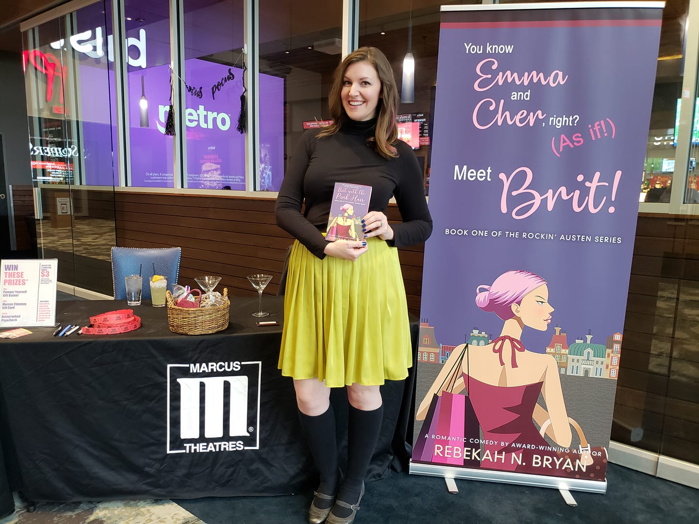
I went with lavender and lime—girly, fun, and a bit eye-searing—which is why I chose to wear that chartreuse skirt pictured above for the release of Brit with the Pink Hair. Not to mention, I painted my nails blue to go along with my book Sharnita with the Blue Nails. (You can’t really see it, but I also had a strand of pink hair that day. I’m a bit extra sometimes…)
Back when I was promoting my Fandom books, my brand colors were red and orange, and I tried to wear one or the other at any book-related event I went to.
To delve deeper into your brand, you can even come up with a signature smell or taste. I came up with toasted marshmallow, and I sometimes now burn marshmallow-scented candles while writing for extra inspiration.
To give credit where it’s due, this wisdom came from a 2016 talk at the UW Writers’ Institute from Melanie Schmidt of Timpano Consulting.
A pithy tagline wouldn’t hurt either.
For my Fandom books, I used to use the tagline, “Not obsessed. Dedicated. Stories about people who toe the line between crazy and conventional.” Now that I’m settling into the chick lit genre, I switched it to what’s in my header now.
…Women who only LOOK like they have it all together
I came up with this messaging while listening to Cecelia Mecca speak at the Sell More Book Show Summit 2019, and I actually got a little teary-eyed. That’s me (or so I’ve been told, and I do agree), those are my characters, and that’s my ideal reader. Or at least people who like reading about women like that.
Once you’ve determined what your brand is, readers will know what you stand for, and you can start to build a like-minded community around that.
So ladies, if you feel like a mess but you hide it well, welcome, my dears.
There’s no such thing as too over the top.
My friend and local writer, Sara Dahmen, who’s got her brand nailed to a wall (figuratively) has spoken on this subject several times, one of which was at the Chanticleer Authors Conference in 2018. One of the topics she covered was FASHION.
Yesssss, this I can do.
When you stand out, book sellers or event organizers will recognize that you can do more. They can plan an event around you if you show them something original. If you have characters that do something, do it, and take pictures. Live your book, if you can.
After hearing her talk, I came up with this outfit for the very next writers’ conference I attended, where I had a table set up.
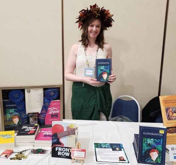
It was memorable, it got people to my table, and it was only slightly embarrassing. Worth it!
If you’re not ready to don a headdress (I can’t imagine why not), you don’t have to go that crazy either. For example, Sara makes sure to consistently wear plaid flannel at her events to go along with her historical fiction and related copper cookware line. It can be as simple as that. The key word is consistency. Speaking of…
Be consistent with imagery and fonts.
Admittedly, I’m not that great at Instagram. I enjoy it, but a photographer I am not. I do try to use one or two Instagram filters for all my posts. Since my brand colors are bright, I typically go for Clarendon if it works for the photo I’m using.
If you want to follow someone who’s killing the Instagram game, check out another one of my friends and local authors Malinda Andrews @malindawrites. Instead of carefully curated posts, Malinda focuses on reality and human connection by posting about her son, her kitties, and of course, her writing process and books. And lots of selfies! (I do love a good selfie.) She also uses good hashtags and interacts with others in a genuine way.
As far as fonts go, have one primary font, and use no more than three. My primary font is the one on my header image, but I wouldn’t be surprised if you find more than three fonts on this website…
And that’s about it.
I don’t have this all perfected yet. Not by a long shot. For example, I’m still trying to figure out how to present myself as an Austen-inspired chick lit/romantic comedy author on social media while not alienating or turning off Jane Austen fans. It’s not easy to come up with Jane Austen–related content all the time, but I could and should do it more often than I currently do.
One final thought. Remember that “author voice” I complained about in the beginning? Use that in all your messaging.
So now, the burning question is, what would your brand smell like?